今天这篇文章主要是通过Python对科比职业生涯的投篮数据进行分析。
原文
数据
本文将探索科比职业生涯的出手数据,并观察是否有热手效应。
首先导入需要用到的库
1 2 3 4 5 6 7 8 9 10 11 12
| import pandas as pd import numpy as np import matplotlib.pyplot as plt from matplotlib.patches import Circle, Rectangle, Arc, Ellipse from sklearn import mixture from sklearn import ensemble from sklearn import model_selection from sklearn.metrics import accuracy_score as accuracy from sklearn.metrics import log_loss import time import itertools import operator
|
然后导入数据并创建一些有效的字段。
1 2 3 4 5 6 7 8 9 10 11 12 13 14
| allData = pd.read_csv('data.csv') data = allData[allData['shot_made_flag'].notnull()].reset_index() data['game_date_DT'] = pd.to_datetime(data['game_date']) data['dayOfWeek'] = data['game_date_DT'].dt.dayofweek data['dayOfYear'] = data['game_date_DT'].dt.dayofyear data['secondsFromPeriodEnd'] = 60*data['minutes_remaining']+data['seconds_remaining'] data['secondsFromPeriodStart'] = 60*(11-data['minutes_remaining'])+(60-data['seconds_remaining']) data['secondsFromGameStart'] = (data['period'] <= 4).astype(int)*(data['period']-1)*12*60 + (data['period'] > 4).astype(int)*((data['period']-4)*5*60 + 3*12*60) + data['secondsFromPeriodStart'] print(data.loc[:10,['period','minutes_remaining','seconds_remaining','secondsFromGameStart']])
|
上面的代码主要计算了一下剩余比赛的时间以及开始时间。
allData['shot_made_flag'].notnull()去除shot_made_flag这一列数据的非空数据。
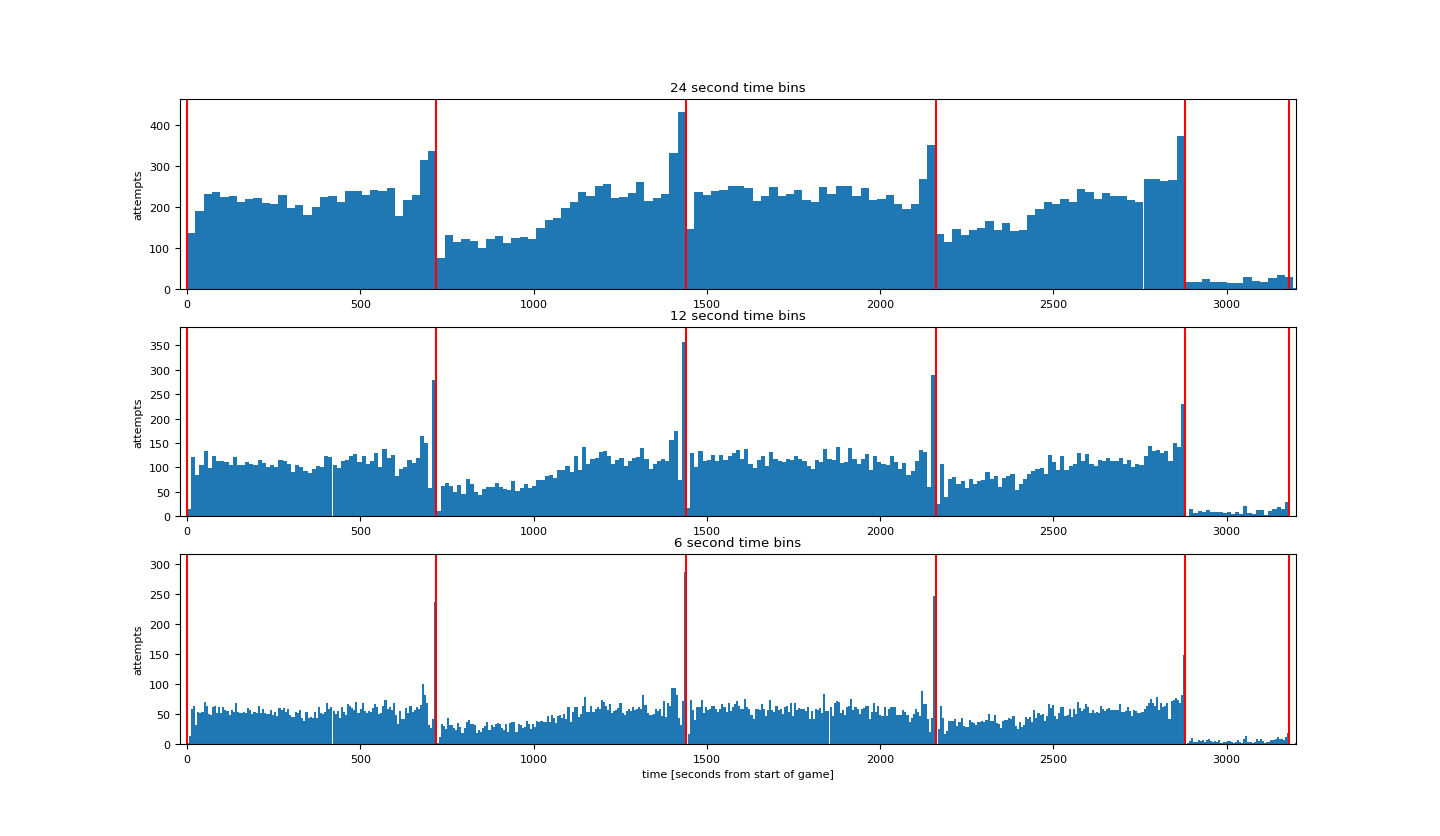
下面绘制根据比赛时间的出手次数的图。时间间隔分别是24秒,12秒,6秒。
1 2 3 4 5 6 7 8 9 10 11 12 13 14 15 16 17 18 19 20 21
| plt.rcParams['figure.figsize'] = (16, 16) plt.rcParams['font.size'] = 8 binsSizes = [24, 12, 6] plt.figure() for k, binSizeInSeconds in enumerate(binsSizes): timeBins = np.arange(0, 60 * (4 * 12 + 3 * 5), binSizeInSeconds) + 0.01 attemptsAsFunctionOfTime, b = np.histogram(data['secondsFromGameStart'], bins=timeBins) maxHeight = max(attemptsAsFunctionOfTime) + 30 barWidth = 0.999 * (timeBins[1] - timeBins[0]) plt.subplot(len(binsSizes), 1, k + 1); plt.bar(timeBins[:-1], attemptsAsFunctionOfTime, align='edge', width=barWidth) plt.title(str(binSizeInSeconds) + ' second time bins') plt.vlines(x=[0, 12 * 60, 2 * 12 * 60, 3 * 12 * 60, 4 * 12 * 60, 4 * 12 * 60 + 5 * 60, 4 * 12 * 60 + 2 * 5 * 60,4 * 12 * 60 + 3 * 5 * 60], ymin=0, ymax=maxHeight, colors='r') plt.xlim((-20, 3200)) plt.ylim((0, maxHeight)) plt.ylabel('attempts') plt.xlabel('time [seconds from start of game]') plt.show()
|
其中np.histogram(data['secondsFromGameStart'], bins=timeBins)以timeBins为间隔统计secondsFromGameStart这一列的直方图。
得到结果如下:
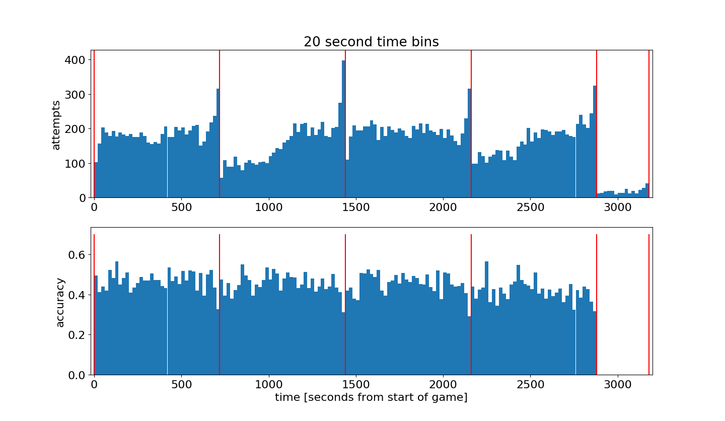
然后根据比赛时间计算并绘制投篮命中率的图,时间间隔为20s:
1 2 3 4 5 6 7 8 9 10 11 12 13 14 15 16 17 18 19 20 21 22 23 24
| plt.rcParams['figure.figsize'] = (15, 10) plt.rcParams['font.size'] = 16 binSizeInSeconds = 20 timeBins = np.arange(0,60*(4*12+3*5),binSizeInSeconds)+0.01 attemptsAsFunctionOfTime, b = np.histogram(data['secondsFromGameStart'], bins=timeBins) madeAttemptsAsFunctionOfTime, b = np.histogram(data.loc[data['shot_made_flag']==1,'secondsFromGameStart'], bins=timeBins) attemptsAsFunctionOfTime[attemptsAsFunctionOfTime < 1] = 1 accuracyAsFunctionOfTime = madeAttemptsAsFunctionOfTime.astype(float)/attemptsAsFunctionOfTime accuracyAsFunctionOfTime[attemptsAsFunctionOfTime <= 50] = 0 maxHeight = max(attemptsAsFunctionOfTime) + 30 barWidth = 0.999*(timeBins[1]-timeBins[0]) plt.figure() plt.subplot(2,1,1); plt.bar(timeBins[:-1],attemptsAsFunctionOfTime, align='edge', width=barWidth) plt.xlim((-20,3200)); plt.ylim((0,maxHeight)); plt.ylabel('attempts'); plt.title(str(binSizeInSeconds) + ' second time bins') plt.vlines(x=[0,12*60,2*12*60,3*12*60,4*12*60,4*12*60+5*60,4*12*60+2*5*60,4*12*60+3*5*60], ymin=0,ymax=maxHeight, colors='r') plt.subplot(2,1,2); plt.bar(timeBins[:-1],accuracyAsFunctionOfTime, align='edge', width=barWidth) plt.xlim((-20,3200)); plt.ylabel('accuracy'); plt.xlabel('time [seconds from start of game]') plt.vlines(x=[0,12*60,2*12*60,3*12*60,4*12*60,4*12*60+5*60,4*12*60+2*5*60,4*12*60+3*5*60], ymin=0.0,ymax=0.7, colors='r') plt.show()
|
代码的第7,8行分别计算根据比赛时间的投篮次数和命中次数的直方图。并根据这两个数据计算命中率并绘图。
然后探索位置对科比投篮的影响。
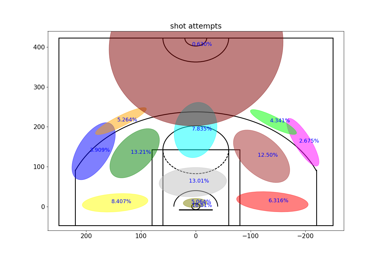
首先建立一个高斯混合模型(GMM)来总结科比的投篮区域分布。将投篮区域分为13个区域。
1 2 3 4 5 6 7 8
| numGaussians = 13 gaussianMixtureModel = mixture.GaussianMixture(n_components=numGaussians,covariance_type='full', init_params='kmeans', n_init=50,verbose=0, random_state=5) gaussianMixtureModel.fit(data.loc[:,['loc_x','loc_y']]) data['shotLocationCluster'] = gaussianMixtureModel.predict(data.loc[:,['loc_x','loc_y']])
|
然后定义两个函数,一个用来绘制篮球场,一个用来绘制高斯数据。
1 2 3 4 5 6 7 8 9 10 11 12 13 14 15 16 17 18 19 20 21 22 23 24 25 26 27 28 29 30 31 32 33 34 35 36 37 38 39 40 41 42 43 44 45 46 47 48 49 50 51 52 53 54 55 56 57 58 59 60 61 62 63 64 65 66 67 68 69 70 71 72 73 74 75 76 77 78 79 80 81 82 83 84 85 86 87 88 89 90 91 92 93 94 95 96 97 98 99
| numGaussians = 13 gaussianMixtureModel = mixture.GaussianMixture(n_components=numGaussians, covariance_type='full', init_params='kmeans', n_init=50, verbose=0, random_state=5) gaussianMixtureModel.fit(data.loc[:,['loc_x','loc_y']]) data['shotLocationCluster'] = gaussianMixtureModel.predict(data.loc[:,['loc_x','loc_y']]) def draw_court(ax=None, color='black', lw=2, outer_lines=False): if ax is None: ax = plt.gca() hoop = Circle((0, 0), radius=7.5, linewidth=lw, color=color, fill=False) backboard = Rectangle((-30, -7.5), 60, -1, linewidth=lw, color=color) outer_box = Rectangle((-80, -47.5), 160, 190, linewidth=lw, color=color, fill=False) inner_box = Rectangle((-60, -47.5), 120, 190, linewidth=lw, color=color, fill=False) top_free_throw = Arc((0, 142.5), 120, 120, theta1=0, theta2=180, linewidth=lw, color=color, fill=False) bottom_free_throw = Arc((0, 142.5), 120, 120, theta1=180, theta2=0, linewidth=lw, color=color, linestyle='dashed') restricted = Arc((0, 0), 80, 80, theta1=0, theta2=180, linewidth=lw, color=color) corner_three_a = Rectangle((-220, -47.5), 0, 140, linewidth=lw, color=color) corner_three_b = Rectangle((220, -47.5), 0, 140, linewidth=lw, color=color) three_arc = Arc((0, 0), 475, 475, theta1=22, theta2=158, linewidth=lw, color=color) center_outer_arc = Arc((0, 422.5), 120, 120, theta1=180, theta2=0, linewidth=lw, color=color) center_inner_arc = Arc((0, 422.5), 40, 40, theta1=180, theta2=0, linewidth=lw, color=color) court_elements = [hoop, backboard, outer_box, inner_box, top_free_throw, bottom_free_throw, restricted, corner_three_a, corner_three_b, three_arc, center_outer_arc, center_inner_arc] if outer_lines: outer_lines = Rectangle((-250, -47.5), 500, 470, linewidth=lw, color=color, fill=False) court_elements.append(outer_lines) for element in court_elements: ax.add_patch(element) return ax def Draw2DGaussians(gaussianMixtureModel, ellipseColors, ellipseTextMessages): fig, h = plt.subplots() for i, (mean, covarianceMatrix) in enumerate(zip(gaussianMixtureModel.means_, gaussianMixtureModel.covariances_)): v, w = np.linalg.eigh(covarianceMatrix) v = 2.5 * np.sqrt(v) u = w[0] / np.linalg.norm(w[0]) angle = np.arctan(u[1] / u[0]) angle = 180 * angle / np.pi currEllipse = Ellipse(mean, v[0], v[1], 180 + angle, color=ellipseColors[i]) currEllipse.set_alpha(0.5) h.add_artist(currEllipse) h.text(mean[0] + 7, mean[1] - 1, ellipseTextMessages[i], fontsize=13, color='blue')
|
代码中np.linalg.norm()用来计算矩阵或向量的范数,默认为计算2范数。np.linalg.eigh()用来计算埃尔米特矩阵或对称矩阵的特征值和特征向量。
然后绘制2D高斯投篮图,图中的数字代表该区域投篮数的比重。
1 2 3 4 5 6 7 8 9 10 11 12 13
| plt.rcParams['figure.figsize'] = (13, 10) plt.rcParams['font.size'] = 15 ellipseTextMessages = [str(100*gaussianMixtureModel.weights_[x])[:5]+'%' for x in range(numGaussians)] ellipseColors = ['red','green','purple','cyan','magenta','yellow','blue','orange','silver','maroon','lime','olive','brown','darkblue'] Draw2DGaussians(gaussianMixtureModel, ellipseColors, ellipseTextMessages) draw_court(outer_lines=True) plt.ylim(-60,440) plt.xlim(270,-270) plt.title('shot attempts') plt.show()
|
从图中可以看出,科比的投篮出手更多地在球场的左侧(从他的视角则为右侧),可能是因为他是一名右手球员。
并且比例最大为16.8%,直接来自篮下,并且还有5.05%来自靠近篮筐的区域。
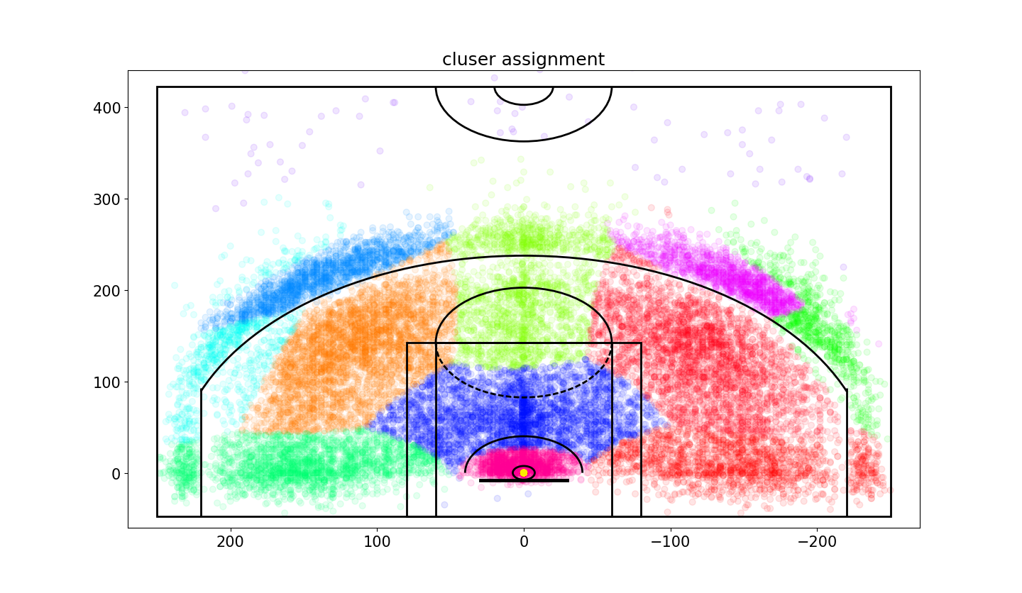
下面画出投篮的散点图来验证上面的高斯混合模型的正确性。
1 2 3 4 5 6 7 8 9 10
| plt.rcParams['figure.figsize'] = (13, 10) plt.rcParams['font.size'] = 15 plt.figure(); draw_court(outer_lines=True) plt.ylim(-60,440) plt.xlim(270,-270) plt.title('cluser assignment') plt.scatter(x=data['loc_x'],y=data['loc_y'],c=data['shotLocationCluster'],s=40,cmap='hsv',alpha=0.1) plt.show()
|
然后计算每个区域的命中率。图中的数字代表该区域的命中率。
1 2 3 4 5 6 7 8 9 10 11 12 13 14 15 16 17 18
| plt.rcParams['figure.figsize'] = (13, 10) plt.rcParams['font.size'] = 15 variableCategories = data['shotLocationCluster'].value_counts().index.tolist() clusterAccuracy = {} for category in variableCategories: shotsAttempted = np.array(data['shotLocationCluster'] == category).sum() shotsMade = np.array(data.loc[data['shotLocationCluster'] == category,'shot_made_flag'] == 1).sum() clusterAccuracy[category] = float(shotsMade)/shotsAttempted ellipseTextMessages = [str(100*clusterAccuracy[x])[:4]+'%' for x in range(numGaussians)] Draw2DGaussians(gaussianMixtureModel, ellipseColors, ellipseTextMessages) draw_court(outer_lines=True) plt.ylim(-60,440) plt.xlim(270,-270) plt.title('shot accuracy') plt.show()
|
从图中可以发现,科比不仅在右侧(他的视角)出手次数比较多,而且命中率也相对比较高。
接下来,将会根据投篮的性质来评估投篮难度(比如投篮方式或者投篮距离)。
首先构造一个投篮难度模型的列表
1 2 3 4 5 6 7 8 9 10 11 12 13 14 15 16 17 18 19 20 21 22 23 24 25 26 27 28 29 30 31 32 33 34
| def FactorizeCategoricalVariable(inputDB, categoricalVarName): opponentCategories = inputDB[categoricalVarName].value_counts().index.tolist() outputDB = pd.DataFrame() for category in opponentCategories: featureName = categoricalVarName + ': ' + str(category) outputDB[featureName] = (inputDB[categoricalVarName] == category).astype(int) return outputDB featuresDB = pd.DataFrame() featuresDB['homeGame'] = data['matchup'].apply(lambda x: 1 if (x.find('@') < 0) else 0) featuresDB = pd.concat([featuresDB, FactorizeCategoricalVariable(data, 'opponent')], axis=1) featuresDB = pd.concat([featuresDB, FactorizeCategoricalVariable(data, 'action_type')], axis=1) featuresDB = pd.concat([featuresDB, FactorizeCategoricalVariable(data, 'shot_type')], axis=1) featuresDB = pd.concat([featuresDB, FactorizeCategoricalVariable(data, 'combined_shot_type')], axis=1) featuresDB = pd.concat([featuresDB, FactorizeCategoricalVariable(data, 'shot_zone_basic')], axis=1) featuresDB = pd.concat([featuresDB, FactorizeCategoricalVariable(data, 'shot_zone_area')], axis=1) featuresDB = pd.concat([featuresDB, FactorizeCategoricalVariable(data, 'shot_zone_range')], axis=1) featuresDB = pd.concat([featuresDB, FactorizeCategoricalVariable(data, 'shotLocationCluster')], axis=1) featuresDB['playoffGame'] = data['playoffs'] featuresDB['locX'] = data['loc_x'] featuresDB['locY'] = data['loc_y'] featuresDB['distanceFromBasket'] = data['shot_distance'] featuresDB['secondsFromPeriodEnd'] = data['secondsFromPeriodEnd'] featuresDB['dayOfWeek_cycX'] = np.sin(2 * np.pi * (data['dayOfWeek'] / 7)) featuresDB['dayOfWeek_cycY'] = np.cos(2 * np.pi * (data['dayOfWeek'] / 7)) featuresDB['timeOfYear_cycX'] = np.sin(2 * np.pi * (data['dayOfYear'] / 365)) featuresDB['timeOfYear_cycY'] = np.cos(2 * np.pi * (data['dayOfYear'] / 365)) labelsDB = data['shot_made_flag']
|
代码中.tolist()方法可以将数组转化为列表。value_counts()用来计算列表中某一数据的数量。
建立一个基于featuresDB的模型,并确保模型没有过拟合(测试误差和训练误差一致)。
用ExtraTreesClassifier模型来检验。
1 2 3 4 5 6 7 8 9 10 11 12 13 14 15 16 17 18 19 20 21 22 23 24 25 26 27 28 29 30 31 32 33 34 35 36 37 38 39 40 41 42
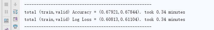
| randomSeed = 1 numFolds = 4 stratifiedCV = model_selection.StratifiedKFold(n_splits=numFolds, shuffle=True, random_state=randomSeed) mainLearner = ensemble.ExtraTreesClassifier(n_estimators=500, max_depth=5, min_samples_leaf=120, max_features=120, criterion='entropy', bootstrap=False, n_jobs=-1, random_state=randomSeed) startTime = time.time() trainAccuracy = [] validAccuracy = [] trainLogLosses = [] validLogLosses = [] for trainInds, validInds in stratifiedCV.split(featuresDB, labelsDB): X_train_CV = featuresDB.iloc[trainInds, :] y_train_CV = labelsDB.iloc[trainInds] X_valid_CV = featuresDB.iloc[validInds, :] y_valid_CV = labelsDB.iloc[validInds] mainLearner.fit(X_train_CV, y_train_CV) y_train_hat_mainLearner = mainLearner.predict_proba(X_train_CV)[:, 1] y_valid_hat_mainLearner = mainLearner.predict_proba(X_valid_CV)[:, 1] trainAccuracy.append(accuracy(y_train_CV, y_train_hat_mainLearner > 0.5)) validAccuracy.append(accuracy(y_valid_CV, y_valid_hat_mainLearner > 0.5)) trainLogLosses.append(log_loss(y_train_CV, y_train_hat_mainLearner)) validLogLosses.append(log_loss(y_valid_CV, y_valid_hat_mainLearner)) print("-----------------------------------------------------") print("total (train,valid) Accuracy = (%.5f,%.5f). took %.2f minutes" % ( np.mean(trainAccuracy), np.mean(validAccuracy), (time.time() - startTime) / 60)) print("total (train,valid) Log Loss = (%.5f,%.5f). took %.2f minutes" % ( np.mean(trainLogLosses), np.mean(validLogLosses), (time.time() - startTime) / 60)) print("-----------------------------------------------------")
|
得到结果如下:
给模型的原始条目添加’shotDifficulty’
1 2
| mainLearner.fit(featuresDB, labelsDB) data['shotDifficulty'] = mainLearner.predict_proba(featuresDB)[:,1]
|
根据ET分类器观察特征的重要程度:
1 2 3 4 5 6
| featureInds = mainLearner.feature_importances_.argsort()[::-1] featureImportance = pd.DataFrame(np.concatenate((featuresDB.columns[featureInds,None], mainLearner.feature_importances_[featureInds,None]), axis=1), columns=['featureName', 'importanceET']) featureImportance.iloc[:30,:]
|
对此,我们将分析两组不同的投篮并分析他们之间的不同。
- 在投篮命中之后的投篮
- 在投篮失败之后的投篮
1 2 3 4 5 6 7 8 9 10 11 12 13 14 15 16 17 18 19 20 21 22 23 24 25 26 27 28 29 30 31 32 33 34 35 36 37 38 39 40 41 42 43 44 45 46 47 48 49 50 51 52 53 54 55 56 57
| timeBetweenShotsDict = {} timeBetweenShotsDict['madeLast'] = [] timeBetweenShotsDict['missedLast'] = [] changeInDistFromBasketDict = {} changeInDistFromBasketDict['madeLast'] = [] changeInDistFromBasketDict['missedLast'] = [] changeInShotDifficultyDict = {} changeInShotDifficultyDict['madeLast'] = [] changeInShotDifficultyDict['missedLast'] = [] afterMadeShotsList = [] afterMissedShotsList = [] for shot in range(1, data.shape[0]): sameGame = data.loc[shot, 'game_date'] == data.loc[shot - 1, 'game_date'] samePeriod = data.loc[shot, 'period'] == data.loc[shot - 1, 'period'] if samePeriod and sameGame: madeLastShot = data.loc[shot - 1, 'shot_made_flag'] == 1 missedLastShot = data.loc[shot - 1, 'shot_made_flag'] == 0 timeDifferenceFromLastShot = data.loc[shot, 'secondsFromGameStart'] - data.loc[shot - 1, 'secondsFromGameStart'] distDifferenceFromLastShot = data.loc[shot, 'shot_distance'] - data.loc[shot - 1, 'shot_distance'] shotDifficultyDifferenceFromLastShot = data.loc[shot, 'shotDifficulty'] - data.loc[shot - 1, 'shotDifficulty'] if timeDifferenceFromLastShot < 0: continue if madeLastShot: timeBetweenShotsDict['madeLast'].append(timeDifferenceFromLastShot) changeInDistFromBasketDict['madeLast'].append(distDifferenceFromLastShot) changeInShotDifficultyDict['madeLast'].append(shotDifficultyDifferenceFromLastShot) afterMadeShotsList.append(shot) if missedLastShot: timeBetweenShotsDict['missedLast'].append(timeDifferenceFromLastShot) changeInDistFromBasketDict['missedLast'].append(distDifferenceFromLastShot) changeInShotDifficultyDict['missedLast'].append(shotDifficultyDifferenceFromLastShot) afterMissedShotsList.append(shot) afterMissedData = data.iloc[afterMissedShotsList, :] afterMadeData = data.iloc[afterMadeShotsList, :] shotChancesListAfterMade = afterMadeData['shotDifficulty'].tolist() totalAttemptsAfterMade = afterMadeData.shape[0] totalMadeAfterMade = np.array(afterMadeData['shot_made_flag'] == 1).sum() shotChancesListAfterMissed = afterMissedData['shotDifficulty'].tolist() totalAttemptsAfterMissed = afterMissedData.shape[0] totalMadeAfterMissed = np.array(afterMissedData['shot_made_flag'] == 1).sum()
|
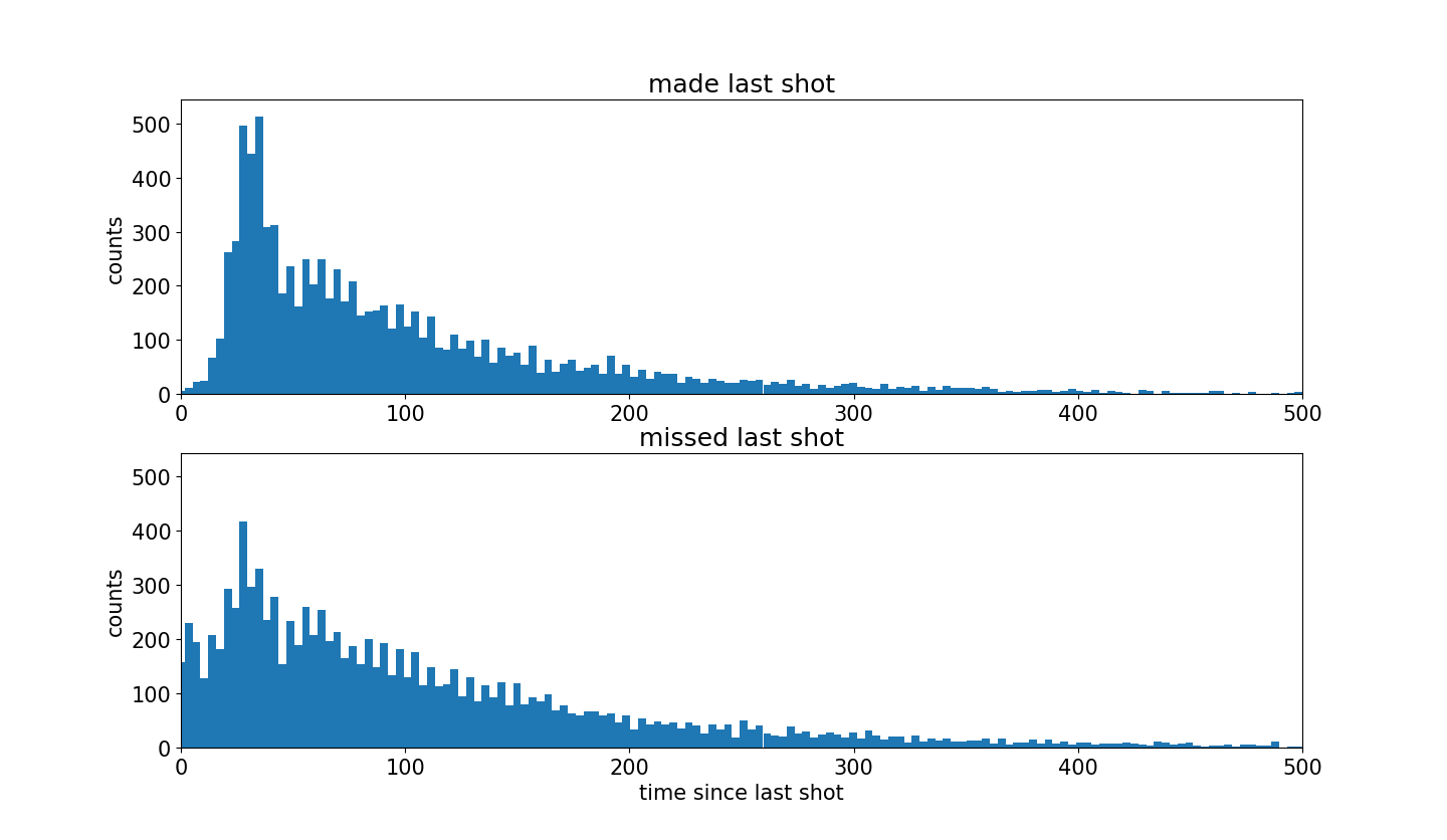
对上面两组数据绘制柱形图
1 2 3 4 5 6 7 8 9 10 11 12 13 14 15
| plt.rcParams['figure.figsize'] = (13, 10) jointHist, timeBins = np.histogram(timeBetweenShotsDict['madeLast']+timeBetweenShotsDict['missedLast'],bins=200) barWidth = 0.999*(timeBins[1]-timeBins[0]) timeDiffHist_GivenMadeLastShot, b = np.histogram(timeBetweenShotsDict['madeLast'],bins=timeBins) timeDiffHist_GivenMissedLastShot, b = np.histogram(timeBetweenShotsDict['missedLast'],bins=timeBins) maxHeight = max(max(timeDiffHist_GivenMadeLastShot),max(timeDiffHist_GivenMissedLastShot)) + 30 plt.figure(); plt.subplot(2,1,1); plt.bar(timeBins[:-1], timeDiffHist_GivenMadeLastShot, width=barWidth); plt.xlim((0,500)); plt.ylim((0,maxHeight)) plt.title('made last shot'); plt.ylabel('counts') plt.subplot(2,1,2); plt.bar(timeBins[:-1], timeDiffHist_GivenMissedLastShot, width=barWidth); plt.xlim((0,500)); plt.ylim((0,maxHeight)) plt.title('missed last shot'); plt.xlabel('time since last shot'); plt.ylabel('counts')
|
可以发现,当科比投篮命中之后,更加渴望下一次投篮。
图像前面有一段沉默的区域是因为当投篮命中之后,球在对方手上,并且一段时间之后才会再一次 得到球。
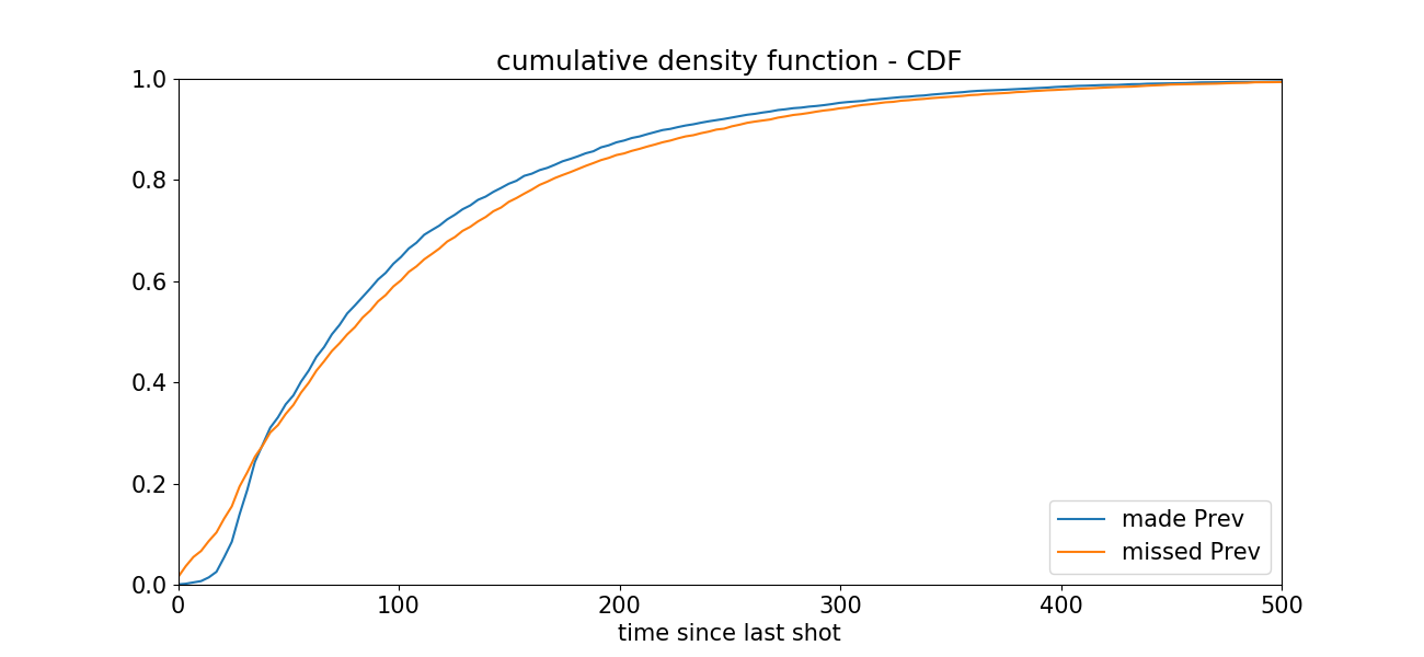
绘制累计直方图,来更好地可视化两个直方图之间的差异。
1 2 3 4 5 6 7 8 9 10 11 12 13 14
| plt.rcParams['figure.figsize'] = (13, 6) timeDiffCumHist_GivenMadeLastShot = np.cumsum(timeDiffHist_GivenMadeLastShot).astype(float) timeDiffCumHist_GivenMadeLastShot = timeDiffCumHist_GivenMadeLastShot/max(timeDiffCumHist_GivenMadeLastShot) timeDiffCumHist_GivenMissedLastShot = np.cumsum(timeDiffHist_GivenMissedLastShot).astype(float) timeDiffCumHist_GivenMissedLastShot = timeDiffCumHist_GivenMissedLastShot/max(timeDiffCumHist_GivenMissedLastShot) maxHeight = max(timeDiffCumHist_GivenMadeLastShot[-1],timeDiffCumHist_GivenMissedLastShot[-1]) plt.figure() madePrev = plt.plot(timeBins[:-1], timeDiffCumHist_GivenMadeLastShot, label='made Prev'); plt.xlim((0,500)) missedPrev = plt.plot(timeBins[:-1], timeDiffCumHist_GivenMissedLastShot, label='missed Prev'); plt.xlim((0,500)); plt.ylim((0,1)) plt.title('cumulative density function - CDF'); plt.xlabel('time since last shot'); plt.legend(loc='lower right')
|
代码中np.cumsum()用来计算数据中的累计值。
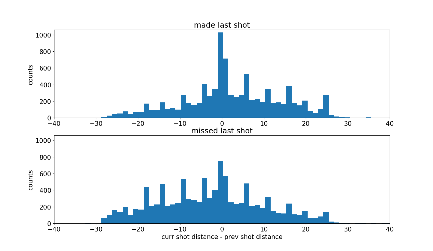
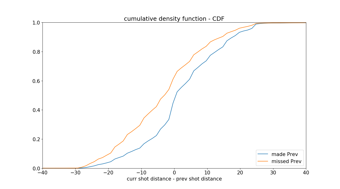
绘制两组数据的’当前投篮距离-前一次投篮距离’的直方图。
如果科比先近距离投篮然后远距离投篮,那么计算结果为正值,反之亦然,如果科比先远距离投篮,然后在近距离投篮,计算结果为负值。
1 2 3 4 5 6 7 8 9 10 11 12 13 14
| plt.rcParams['figure.figsize'] = (13, 10) jointHist, distDiffBins = np.histogram(changeInDistFromBasketDict['madeLast']+changeInDistFromBasketDict['missedLast'],bins=100,density=False) barWidth = 0.999*(distDiffBins[1]-distDiffBins[0]) distDiffHist_GivenMadeLastShot, b = np.histogram(changeInDistFromBasketDict['madeLast'],bins=distDiffBins) distDiffHist_GivenMissedLastShot, b = np.histogram(changeInDistFromBasketDict['missedLast'],bins=distDiffBins) maxHeight = max(max(distDiffHist_GivenMadeLastShot),max(distDiffHist_GivenMissedLastShot)) + 30 plt.figure() plt.subplot(2,1,1); plt.bar(distDiffBins[:-1], distDiffHist_GivenMadeLastShot, width=barWidth); plt.xlim((-40,40)); plt.ylim((0,maxHeight)) plt.title('made last shot'); plt.ylabel('counts') plt.subplot(2,1,2); plt.bar(distDiffBins[:-1], distDiffHist_GivenMissedLastShot, width=barWidth); plt.xlim((-40,40)); plt.ylim((0,maxHeight)) plt.title('missed last shot'); plt.xlabel('curr shot distance - prev shot distance'); plt.ylabel('counts')
|
图中可以清楚地看到投篮命中的图更加倾向于右侧。
因此,可以发现,科比投篮命中之后会更加自信,并因此会冒更大的风险在更远的地方投篮。
这比之前的图更加明显,但绘制累计直方图会更加明显。
1 2 3 4 5 6 7 8 9 10 11 12 13 14
| plt.rcParams['figure.figsize'] = (13, 6) distDiffCumHist_GivenMadeLastShot = np.cumsum(distDiffHist_GivenMadeLastShot).astype(float) distDiffCumHist_GivenMadeLastShot = distDiffCumHist_GivenMadeLastShot/max(distDiffCumHist_GivenMadeLastShot) distDiffCumHist_GivenMissedLastShot = np.cumsum(distDiffHist_GivenMissedLastShot).astype(float) distDiffCumHist_GivenMissedLastShot = distDiffCumHist_GivenMissedLastShot/max(distDiffCumHist_GivenMissedLastShot) maxHeight = max(distDiffCumHist_GivenMadeLastShot[-1],distDiffCumHist_GivenMissedLastShot[-1]) plt.figure() madePrev = plt.plot(distDiffBins[:-1], distDiffCumHist_GivenMadeLastShot, label='made Prev'); plt.xlim((-40,40)) missedPrev = plt.plot(distDiffBins[:-1], distDiffCumHist_GivenMissedLastShot, label='missed Prev'); plt.xlim((-40,40)); plt.ylim((0,1)) plt.title('cumulative density function - CDF'); plt.xlabel('curr shot distance - prev shot distance'); plt.legend(loc='lower right')
|
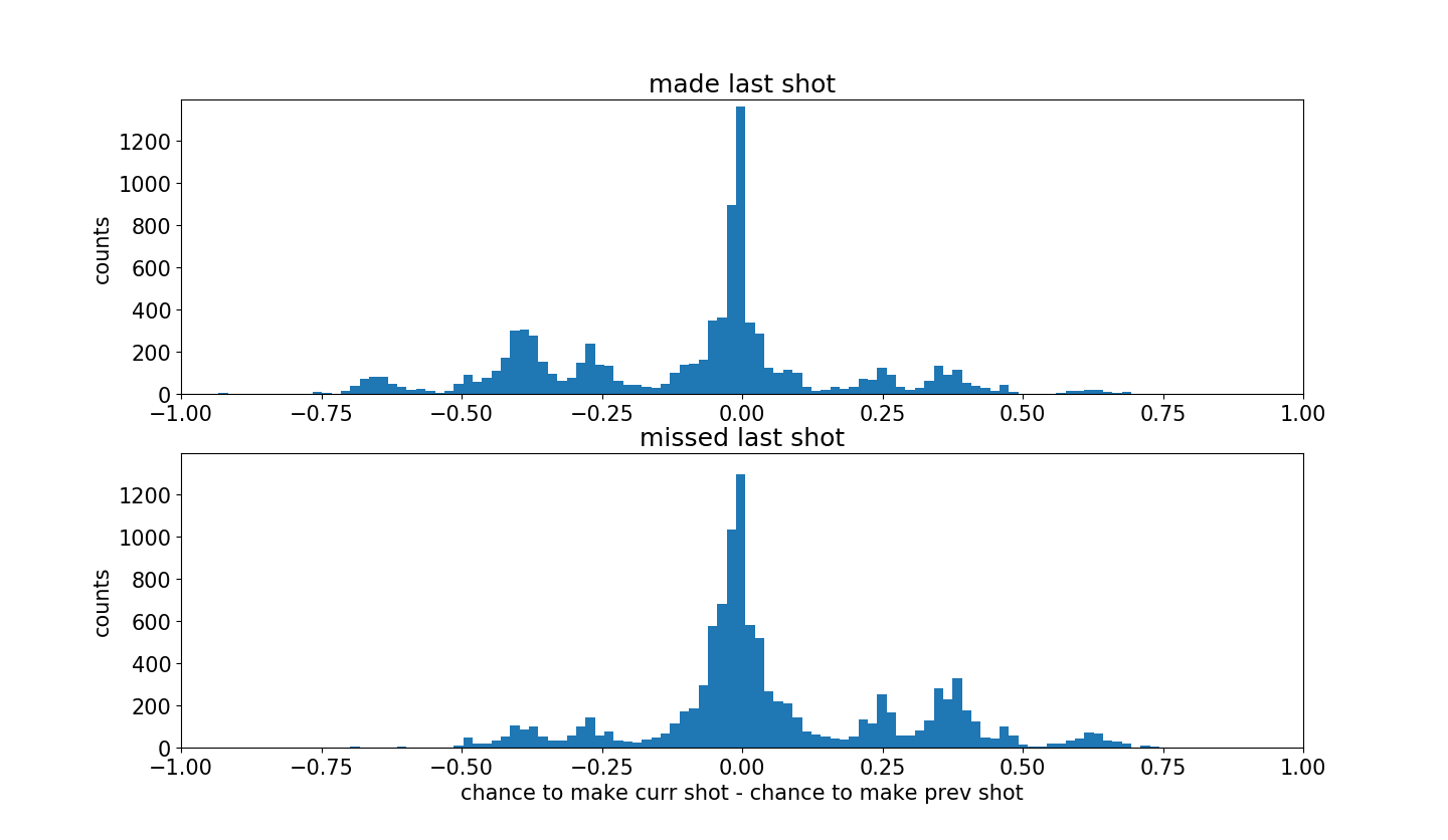
最后,绘制两组数据投篮难度变化。
这里负值代表科比冒更大的风险,正值表示科比采取比较保险的投篮。
1 2 3 4 5 6 7 8 9 10 11 12 13 14 15
| plt.rcParams['figure.figsize'] = (13, 10) jointHist, difficultyDiffBins = np.histogram(changeInShotDifficultyDict['madeLast']+changeInShotDifficultyDict['missedLast'],bins=100) barWidth = 0.999*(difficultyDiffBins[1]-difficultyDiffBins[0]) shotDifficultyDiffHist_GivenMadeLastShot, b = np.histogram(changeInShotDifficultyDict['madeLast'],bins=difficultyDiffBins) shotDifficultyDiffHist_GivenMissedLastShot, b = np.histogram(changeInShotDifficultyDict['missedLast'],bins=difficultyDiffBins) maxHeight = max(max(shotDifficultyDiffHist_GivenMadeLastShot),max(shotDifficultyDiffHist_GivenMissedLastShot)) + 30 plt.figure() plt.subplot(2,1,1); plt.bar(difficultyDiffBins[:-1], shotDifficultyDiffHist_GivenMadeLastShot, width=barWidth); plt.xlim((-1,1)); plt.ylim((0,maxHeight)) plt.title('made last shot'); plt.ylabel('counts') plt.subplot(2,1,2); plt.bar(difficultyDiffBins[:-1], shotDifficultyDiffHist_GivenMissedLastShot, width=barWidth); plt.xlim((-1,1)); plt.ylim((0,maxHeight)) plt.title('missed last shot'); plt.xlabel('chance to make curr shot - chance to make prev shot'); plt.ylabel('counts')
|
从图中可以发现,命中的投篮更加倾向于左侧。
说明科比命中之后会就更加自信,并允许自己尝试更加困难的投篮。
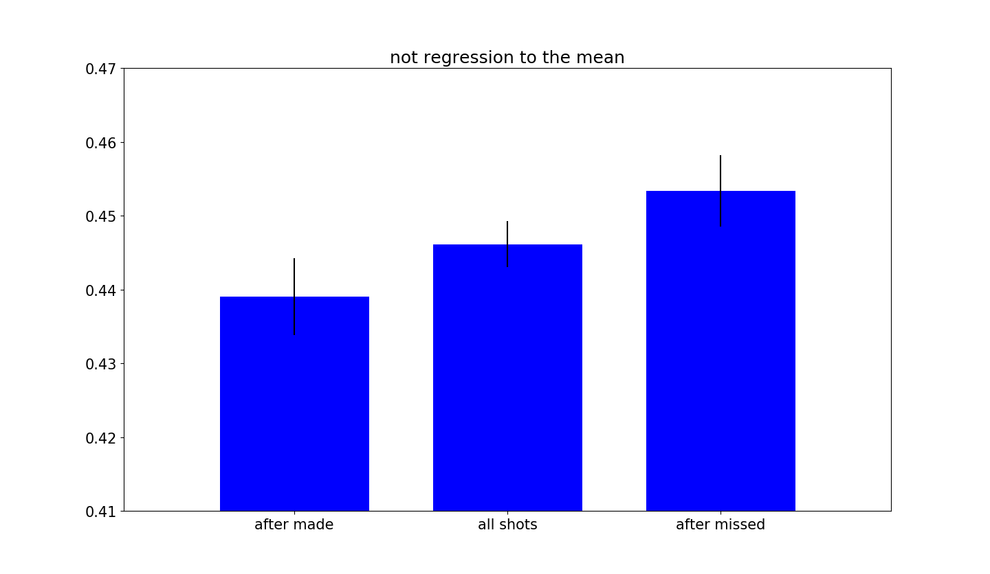
或许你会好奇是否仅仅是简单地对均值的回归。
这种想法是合理的,因为所有命中的投篮都明显地偏向于比较容易的投篮,如果使用相对测量,比如“投篮难度”,肯定会得到这个回归均值的效果,所以需要确保是否是这样。
1 2 3 4 5 6 7 8 9 10 11 12 13 14 15 16 17 18 19 20
| plt.rcParams['figure.figsize'] = (12, 10) accuracyAllShots = data['shot_made_flag'].mean() accuracyAfterMade = afterMadeData['shot_made_flag'].mean() accuracyAfterMissed = afterMissedData['shot_made_flag'].mean() standardErrorAllShots = np.sqrt(accuracyAllShots*(1-accuracyAllShots)/data.shape[0]) standardErrorAfterMade = np.sqrt(accuracyAfterMade*(1-accuracyAfterMade)/afterMadeData.shape[0]) standardErrorAfterMissed = np.sqrt(accuracyAfterMissed*(1-accuracyAfterMissed)/afterMissedData.shape[0]) accuracyVec = np.array([accuracyAfterMade,accuracyAllShots,accuracyAfterMissed]) errorVec = np.array([standardErrorAfterMade,standardErrorAllShots,standardErrorAfterMissed]) barWidth = 0.7 xLocs = np.arange(len(accuracyVec)) + 0.5 fig, h = plt.subplots(); h.bar(xLocs, accuracyVec, barWidth, color='b', yerr=errorVec) h.set_xticks(xLocs); h.set_xticklabels(('after made', 'all shots', 'after missed')) plt.ylim([0.41,0.47]); plt.xlim([-0.3,3.3]); plt.title('not regression to the mean')
|
现在可以确定不是简单地均值回归,实际上两种不同的投篮数据组有非常不同的命中率。那么有一个问题出现了
科比手热的感觉是否正确?
获取科比真的感觉到自己的投篮区,并更多地尝试更加困难的投篮。
可以通过创建的投篮困难的模型看出,命中率几乎一致,并没有包含手热的特性。
这个结果表明科比并没有手热的效应。
下面尝试可视化。
1 2 3 4 5 6 7 8 9 10 11 12 13 14
| plt.rcParams['figure.figsize'] = (16, 8) afterMissedData = data.iloc[afterMissedShotsList,:] afterMadeData = data.iloc[afterMadeShotsList,:] plt.figure(); plt.subplot(1,2,1); plt.title('shots after made') plt.scatter(x=afterMadeData['loc_x'],y=afterMadeData['loc_y'],c=afterMadeData['shotLocationCluster'],s=50,cmap='hsv',alpha=0.06) draw_court(outer_lines=True); plt.ylim(-60,440); plt.xlim(270,-270); plt.subplot(1,2,2); plt.title('shots after missed'); plt.scatter(x=afterMissedData['loc_x'],y=afterMissedData['loc_y'],c=afterMissedData['shotLocationCluster'],s=50,cmap='hsv',alpha=0.06) draw_court(outer_lines=True); plt.ylim(-60,440); plt.xlim(270,-270);
|
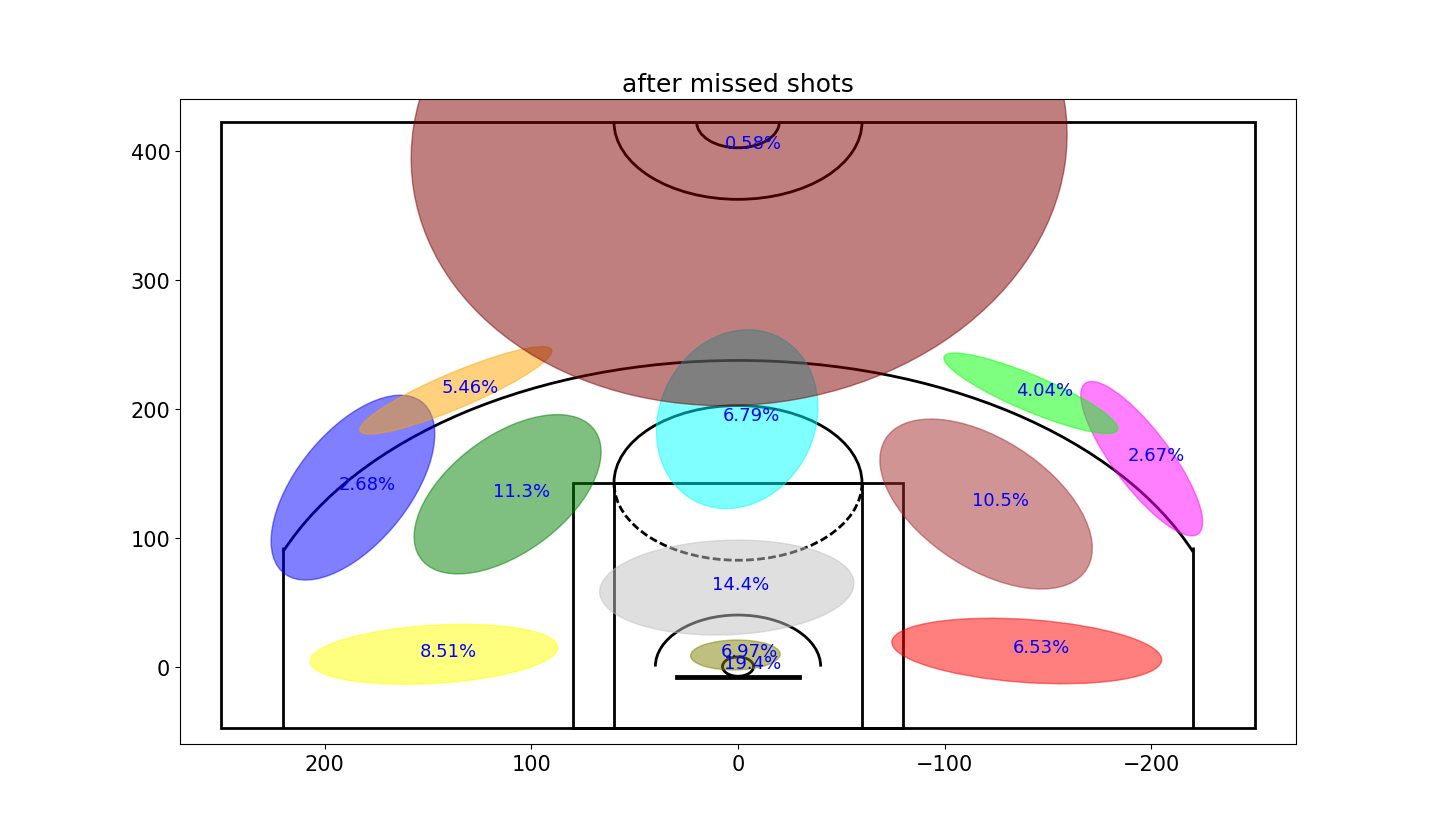
明锐的眼睛或许可以发现这里密度的不同,但是不太明显,因此用高斯格式来显示这些数据。
1 2 3 4 5 6 7 8 9 10 11 12 13 14 15 16 17 18 19 20 21 22
| plt.rcParams['figure.figsize'] = (13, 10) variableCategories = afterMadeData['shotLocationCluster'].value_counts().index.tolist() clusterFrequency = {} for category in variableCategories: shotsAttempted = np.array(afterMadeData['shotLocationCluster'] == category).sum() clusterFrequency[category] = float(shotsAttempted)/afterMadeData.shape[0] ellipseTextMessages = [str(100*clusterFrequency[x])[:4]+'%' for x in range(numGaussians)] Draw2DGaussians(gaussianMixtureModel, ellipseColors, ellipseTextMessages) draw_court(outer_lines=True); plt.ylim(-60,440); plt.xlim(270,-270); plt.title('after made shots') variableCategories = afterMissedData['shotLocationCluster'].value_counts().index.tolist() clusterFrequency = {} for category in variableCategories: shotsAttempted = np.array(afterMissedData['shotLocationCluster'] == category).sum() clusterFrequency[category] = float(shotsAttempted)/afterMissedData.shape[0] ellipseTextMessages = [str(100*clusterFrequency[x])[:4]+'%' for x in range(numGaussians)] Draw2DGaussians(gaussianMixtureModel, ellipseColors, ellipseTextMessages) draw_court(outer_lines=True); plt.ylim(-60,440); plt.xlim(270,-270); plt.title('after missed shots')
|
现在可以清晰地发现,当科比投丢一个球的时候,会更加倾向于直接从篮下来得分(投丢上一个球之后后27%的概率,命中前一个球后有18%的概率)
同样可以明显地看到,当科比命中一个球后接下来更加倾向于投三分。